As online entrepreneurs, we all understand the importance of having a digital presence that speaks to our audience. It’s so important to find a good balance between the way your brand voice comes across and your visuals.
Today, I’m going to be focusing on all of the different designs that make up your online brand. Because a digital presence is truly so much more than just a website! It includes visuals like social media graphics, your newsletter and more! The entire thing works together to represent your brand.
Social Media Graphics
We all know that social media is a great way to increase your visibility and get to know other entrepreneurs. When someone finds you on social media, your profile might be their first impression of you. So make it a good one! Speak in a similar voice and use branded images across all platforms. That way, everything remains consistent and people get to know you, much faster.
I personally focus my visibility strategy on Instagram and Pinterest because I enjoy using those platforms. On Instagram, I like sharing office photos and then offering tips & tricks inside of the caption. To accomplish this, I take photos for Instagram each month. Then I edit the photos and place the ones I want to post into Planoly, my scheduling app. I also like to sprinkle in blog post graphics, quotes, and seasonal images. I make sure that all of the photos are consistent and fit in with my branding. This goes for each individual photo and my grid. My Instagram rule is to never upload something that doesn’t fit in with my brand.
Pinterest, on the other hand, pulls images directly from your blog. Since these images are a part of your website, they better be branded and recognizable as your own! A surefire way to stand out on Pinterest is to use vertical images that have a unique look to them. They should fit in with your brand identity and have a catchy title to get people to click over to your website.
Your Newsletter
There are so many different email platforms out there to choose from. It can be overwhelming to find the one that works best for you. Plus, it seems like everyone has a favorite of their own that they want to promote. I use MailChimp. I realize it’s pretty basic, but it works for me. They recently added Automation to the free plan and that really makes all the difference.
Whatever platform you use, just make sure that your newsletter is visually appealing and fits in with your brand identity. You should have a header graphic at the top of every single newsletter that you send out. Add your logo and maybe even a photo of yourself, to brand your newsletter even more. Adding these graphics will remind your subscribers of your brand, who you are, and why they joined your list.
Another thing to think about is that many email service providers are sending newsletters with tons of graphics right to the spam folder. This will lead to a lower opening rate and less engagement with your audience. So keep in mind that you should always strive to use more copy than imagery in your emails.
Sales Funnels & Opt-in Pages
Many email providers allow you to set-up landing pages inside their platform, which is wonderful! Take advantage of that option, if you have it, and create a landing page template that you can re-use. The important thing here is that it should be consistent with your brand and website. Visitors should feel like they are on a hidden page on your site and not somewhere completely different.
If your email service provider doesn’t offer something like that then you have a few other options. You can use a service like LeadPages or ClickFunnels to create landing pages and funnels for offerings and opt-ins galore. But, these do come with steep monthly fees that you might not want to pay. You could also DIY it and download a few plugins so that you can create a landing page right on WordPress. I have a few tips on how to do that, right here. Or, you can skip the DIY route and hire a designer, like me, to create a sales page or landing page for you!
Other Digital Graphics
This is kind of a catch-all because you might need very different digital graphics than another entrepreneur. One big one that I help a lot of my clients with is digital ads. Your ad should be simple and to the point. I like to make a couple digital advertisements to do some A/B testing and find out which ad performs the best. As with everything in your brand identity, it should remain consistent and easily recognizable.
Freebie PDF’s are another thing that I often help my clients with. This PDF design is given to someone when they opt-in to your list or when they’re taking a course that you offer. You don’t want to hand over something boring like a word doc, that you simply turned into a PDF. It needs to be branded and look professional! When people sign-up for your list, they expect to get something helpful and it needs to look the part. You can either work with a designer to help you or DIY it.
Your Website
And of course, the cornerstone of your digital presence is your website. This is the hub of your business where you want to send traffic to learn more about you, opt-in to your email list, and contact you about your services. All of your other digital graphics should be based on what your brand and website look like. Of course, your website also needs to be modern and easy to navigate. You have a few options on how you can get a website that meets your goals and represents your brand.
DIY Your Website: There are tons of drag-and-drop platforms – my favorite being Squarespace for those that want to DIY. There are also tons and tons of WordPress themes that you can choose from. Just make sure to choose a theme that you love on the demo site. Since these don’t drag-and-drop you won’t be able to customize them too much without hiring a developer.
Hire a Website Designer: If you aren’t into DIYing or are just ready for a more thoughtful design, then it might be time to invest in a designer. My specialty is designing effective brands and websites that look beautiful and target the right people. Ensuring that you don’t waste any time with a design that just doesn’t speak to your audience.
With a custom website, you’ll get to work alongside me every step of the way to make sure that your site is perfect. Your website will be built to grow alongside your business as things inevitably, evolve. Plus, once the process is complete, you’ll have a designer in your back pocket that you already know and trust.
Now you know why your digital presence is so much more than just a website. If you’re ready to uplevel your business with a custom site then you can learn more about the Digital Presence Package options, right here:
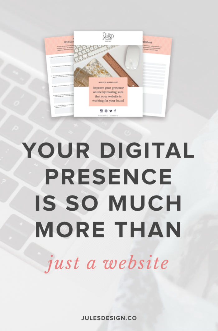
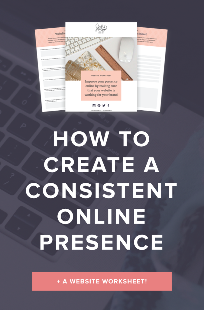
If you want to DIY it, that’s cool too! I’ve got a freebie to help you along the way. My website workbook will help health + wellness pros to audit your current website and come up with a strategy so that you can start making changes and improving what you’ve got.
Become a go-to wellness pro with my Wellness Website Workbook:
In this quick video audit, I’ll walk you through what’s working (and what’s not) on your homepage. I'll share 3 personalized, actionable recommendations to help you improve clarity, connection, and conversions.
Free Homepage Audit for Private Practice Clinicians
Copyright 2022 - All Rights Reserved | Website made by Jules Design (of course!)
Terms & Conditions
Privacy Policy
Jules Design is a Richmond, Virginia–based private practice website design and brand studio serving dietitians, therapists, nutritionists, and healthcare professionals. We create strategic, client-attracting websites for evidence-based clinicians who want a polished and professional online presence.
