 I’m guessing that at some point in your life you’ve come across or created a vision board, inspiration board, or dream board. Maybe not for your business but probably for your personal life.
A moodboard is essentially the same thing but for your brand identity. According to dictionary.com a moodboard is a board used by designers on which samples of various colors and textures are mounted to help in deciding which elements complement each other.
Your moodboard should include things like photos, colors, textures, patterns, typography, and other design elements that inspire you. That way you can really hone in on your design aesthetic to ensure that your brand is moving in a direction that will resonate with your target audience. Today, I’ll be walking your though how to create a moodboard to help you establish your brand visuals.
Why You Should Create a MoodBoard
A moodboard will help you to visualize what you want your brand identity to look like. If you aren’t great at articulating these kinds of things to your designer, it can definitely be helpful to give some visual inspiration to explain the look you’re going for.
Creating a moodboard is an efficient way to play around with different design directions that you might be considering. Try compiling a few and decide which one really resonates with you and your niche. The moodboard that you LOVE is going to produce the brand visuals that you also LOVE. If you hate your moodboard then you’re definitely not going to like your brand identity.
As a designer who incorporates a moodboard into my process, I can tell you that it saves a ton of time later on down the line. A moodboard allows me to take the information that I’ve gathered during the research phase and display it in a visual way pretty quickly. Now my client and I can get crystal clear on the visuals during the revision process. Once I hop into actually designing the brand identity, I already have a clear and approved direction from my client. This sets me up for success to create something that they love and that will work for their brand in the long term.
How to Create a Moodboard
Research
Start by doing some research on your competition to see what’s already out there. You want to design something that will stand out from the crowd but still be relatable to your audience.
Then, take out a piece of paper and write down 5 adjectives that describe your brand and business. You’ll want to keep these adjectives in mind when moving through the moodboard creation process.
Collect Inspiration
Pinterest is an amazing online resource to collect inspiration. It’s really simple to search for whatever you’re looking for and gather some images quickly. Start by creating a secret board for your brand and then start pinning things that represent your business. Remember to keep in mind your adjectives and research from the first part of the process.
Don’t be afraid to look for inspiration offline as well! If you get inspired by a book, magazine, paint sample, or simply just by being out in nature – Snap a picture and add that to the board.
Remove Things That Don’t Fit
Now that you’ve collected all of your inspiration it’s time to refine. Start by looking for similarities. Do you see any consistent colors being used? Any fonts or textures that are consistent? How about photography? Is your board filled with muted neutrals or bright colors?
Analyze what you have and remove things that don’t fit. Look back at those adjectives and make sure that they are in line with what you’re seeing in your moodboard. Consider your audience when making brand decisions and push beyond your personal preferences. Go through 2-3 rounds of curating your board so that it only includes images that truly represent your brand.
Create Your Moodboard
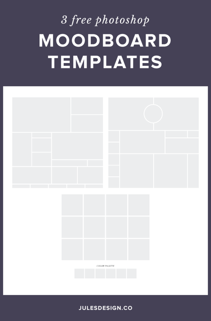
Now you have a curated Pinterest board with only your favorite inspiration pieces in it. Take these final images and start placing them inside a Photoshop or Canva moodboard template. At the bottom of this post, you’ll find some free Photoshop moodboard templates that you can grab.
I recommend including a color palette in your moodboard design. Think of this color palette as a good starting point for colors to explore during the brand design phase. It doesn’t necessarily have to be the exact colors that your brand, ultimately, uses.
This process is really about trial and error. You just want to move things around until you’re happy with the final moodboard.
Yay! I have a Moodboard! Now, what the heck do I do with this?
Use your final moodboard to inspire your brand visuals. Your moodboard represents how you want your brand, to look and feel, to those who interact with it. After completing your moodboard, you’ll have a better understanding of the strategy behind your brand. You will also know exactly what colors, fonts, and overall design aesthetic you want to pursue.
If you’re having trouble creating a moodboard or DIY’ing your brand then consider hiring a designer to take your vision to life. If you’re interested, you can learn more about my brand design process right here.
Watch the Simplify to Sell Website Workshop
I’ll show you how to streamline, connect with your niche, and earn more money from your website during this free on-demand website workshop for health and wellness professionals.
In this quick video audit, I’ll walk you through what’s working (and what’s not) on your homepage. I'll share 3 personalized, actionable recommendations to help you improve clarity, connection, and conversions.
Free Homepage Audit for Private Practice Clinicians
Copyright 2022 - All Rights Reserved | Website made by Jules Design (of course!)
Terms & Conditions
Privacy Policy
Jules Design is a Richmond, Virginia–based private practice website design and brand studio serving dietitians, therapists, nutritionists, and healthcare professionals. We create strategic, client-attracting websites for evidence-based clinicians who want a polished and professional online presence.
