COLOR THEORY
Going back to the basics of color theory is a great place to start when putting together a color palette. If you’re new to design than I definitely recommend familiarizing yourself with the color wheel. If you start by creating color palettes using the following guidelines than it is likely that you will end up with an appealing color palette. The magic really happens though when you create a custom color palette, which doesn’t follow any predefined color schemes. Doing this gives your brand a completely unique look, that represents your true identity.
Monochromatic
Uses variations in lightness and saturation of a single color.

Analogous
Uses a color that is next to each other on the color wheel.

Complimentary
Uses colors that are opposite each other on the color wheel.

Split Complimentary
Uses two colors adjacent to the complementary of the base color.

Triadic
Uses colors that are evenly spaced around the color wheel.

Custom
Doesn’t follow predefined color schemes and isn’t based on any formal rules.

CREATING A CUSTOM COLOR PALETTE
Color will ultimately represent the mood & tone of your branding. Primary colors will be used frequently throughout your identity, while, secondary colors are used less often, usually, as accent colors. It’s a good idea to decide on a few primary colors that you are confident in and then build out from there. Your logo will usually be made up of at least one, but often times more than one, of your primary colors. Secondary colors are perfect for use in illustrations and for things that simply need to look a little different. I personally love using secondary colors on social media because each post looks unique but still ties into the brand identity.
SO, HOW MANY COLORS SHOULD I USE?
That’s completely up to you. It is a custom color palette after all! A good rule of thumb is to include 3-5 primary colors and as many secondary colors as your brand needs. I know, that’s a pretty vague answer, right? But, it really does vary from project to project. I usually include about 5 secondary colors when designing a brand identity for a client. This provides the client with plenty of color options to choose from without overwhelming them with endless possibilities.
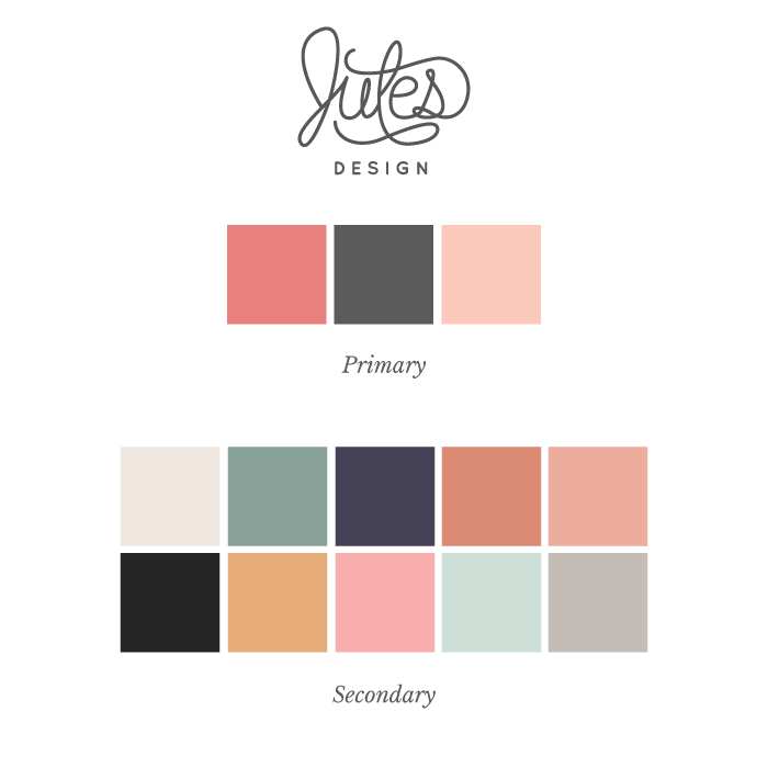
When creating my own identity, I wanted lots of versatility in everything from print collateral to my website. I didn’t want to be limited to mainly coral and gray shades so I opted to include 10 secondary colors in my branding. I intentionally chose shades that compliment my primary colors, such as, shades of green and purple. This ensures that the colors work nicely together in the final composition. I’m confident that I can use these colors without making things look busy. It’s a big no-no to use all the colors at once, by the way 😉
Generally, when I’m finished with clients brand identity they will have around 8-10 total colors in their palette.

NEUTRAL COLORS AND SHADES
When selecting your color palette, make sure that you include a few neutral colors. It’s vital to have at least 1 primary neutral and several secondary neutral options so that all of your colors blend together nicely in a composition. I always add plenty of neutral color options to my custom color palettes because they really tie together all of the different pops of color. Neutrals can make even the brightest shades totally usable.
Layering in different shades or opacities of the same color will give you branding a sophisticated look. It also brings more diversity into your color palette and can soften a design that is really bold.
COLOR RESOURCES
I can’t recommend these websites enough! They are all excellent tools that I use frequently to build color palettes or even just to gather a little inspiration for design projects.
Coolors
Material Palette
Design Seeds
Adobe Color CC
Canva Colors
What are some of your favorite tools for building custom color palettes?
Save
Save