Why Many Health Practitioner Websites Confuse Visitors
I can’t tell you how many times I’ve landed on a website and had absolutely no idea what I was supposed to do next. Thoughts like:
- Whoa, where do I click? The main menu is filled with choices.
- What service is right for me? I see too many options listed on the homepage.
- What is the next step? No clear call to action to get started.
When a website doesn’t clearly guide visitors, most people don’t stick around to figure it out.
They leave.
And unfortunately, that’s exactly what potential clients are doing on many health practice websites.
When someone lands on your website, we want the right people, aka your ideal client, to feel like they’ve found the right place. Your website should make them feel safe, understood, and confident that you can help them.
But many practitioners accidentally create the opposite experience.
Why? Because they try to put everything on the homepage.
They want to show all their services, share every resource, link to every page, and give visitors lots of options.
It seems helpful, but in reality, it often creates overwhelm and confusion.
The truth is, your homepage isn’t supposed to do everything. Its job is to guide visitors toward the next step.
So let’s fix this, shall we?!
Here are three ways to bring clarity to your homepage and make it more likely to convert visitors into clients for your health practice.
1. Homepage Tips for Health Practitioners: Guide Visitors Toward the Next Step
One of the most important questions to ask when designing your homepage is:
What do I want someone to do after they land here?
Many websites try to send visitors in ten different directions:
- Book a session
- Read the blog
- Listen to the podcast
- Join the newsletter
- Learn about my services
- Download a free resource
While all of those things may be valuable, showing them all at once, on the homepage, creates decision fatigue.
Instead, think of your homepage like a guide to getting started.
Think about the three most important pages you want visitors to explore.
For many health practitioners, these are often:
- Your services pages
- Your resource page
- Your booking or consultation page
Your homepage should guide visitors toward these key pages in the order of importance for your health practice. Use section layouts, links, and clear buttons to break things up and bring visual hierarchy to the page.
Your most important page should be highlighted as the main call-to-action. Those secondary pages can still be linked throughout the homepage, but further down the page, with their own section to draw attention to that item.
When your homepage clearly guides visitors toward the next step, it becomes much easier for them to move from curious visitor to potential client.
2. Homepage Tips for Health Practitioners: Help Visitors Get to Know and Trust You
When someone is looking for a therapist, nutritionist, dietitian, health coach, or other practitioner, they aren’t just choosing a helpful service.
They’re choosing a person they feel comfortable working with.
That means trust plays a huge role in whether someone decides to book with you.
Your homepage should give visitors a quick sense of:
- Who you are and who you help
- Your unique approach to health
- Why they can trust you with their health
One of the easiest ways to do this is by including a short About section on your homepage.
This might include:
- A photo of you
- A short introduction
- A few sentences about your philosophy or approach
From there, you can link to your full About page for visitors who want to learn more.
This allows people who are ready to move quickly to continue exploring your services, while also giving those who need more reassurance a place to build deeper trust.
Think of this section as the moment where someone starts thinking: “This practitioner understands what I’m going through because they’ve experienced a similar thing or worked with people who have similar experiences.”
3. Homepage Tips for Health Practitioners: Add Strategic Trust Builders
Before someone reaches out or books an appointment, they often need reassurance that they’re making the right choice.
Your homepage should include a few key elements that help build that confidence. But not too many or it will cause overwhelm.
My favorites to include thoughtfully:
Testimonials: Social proof from past clients helps visitors imagine what working with you might be like and what kinds of results they can expect from your service or program.
Credentials or certifications: This can be especially helpful in health-related fields where expertise and training matter. Don’t make this a big focal point, but be sure to mention it.
Featured content: If you’ve been a guest on podcasts, written articles, or been featured in publications, these can reinforce your authority.
Helpful resources: Blog posts, podcast episodes, videos, or educational content can show your expertise and give visitors a sense of how you support your clients.
The key is to include these elements strategically.
You don’t need to showcase everything you’ve ever created. Instead, choose a few meaningful pieces that help answer the question every visitor is asking:
“Can I trust this person to help me?”
When done well, these trust-building elements encourage visitors to stay on your site longer and take the actions you want them to take.
Simple Homepage Design Tips That Increase Website Conversions for Health Practitioners
When you step back and look at it, your homepage doesn’t need to do as much as you might think.
Instead of trying to include everything, focus on three key goals:
- Guide visitors toward the next step
- Help them get to know and trust you
- Show just enough proof that they feel confident continuing to explore
When your homepage is designed with these goals in mind, it becomes much easier for potential clients to navigate your website and take action.
Want Help Improving Your Website Homepage?
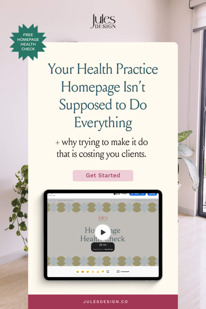
If you’re wondering whether your homepage might be overwhelming visitors or missing key elements, I offer free Homepage Health Checks.
I’ll review your homepage and send you a short personalized video walking through:
- What’s working well
- What may be hurting conversions
- And what I would change to improve your website
You’ll walk away with clear next steps to make your website more effective.