 Being a girl boss is hard work. It seems like there’s always something new to learn and implement to improve your business. But every single girl boss has one tool, that’s always at your disposal. And, you might be overlooking it. Your website.
Your website has the potential to act as an employee for your business – selling your services or offerings automatically. If you carefully curate the experience that your potential clients or customers are seeing, you will get results.
Here are 5 things that every single girl boss should have on their website. The good news is that they are all things that you can implement, THIS week! And, I’ve got a bonus for you, at the end of this article, if you want to get more in tune with your website’s goals and strategy.
An Email Opt-in
If you’re trying to grow your email list…and you definitely SHOULD be trying to grow your email list, then having an enticing email opt-in on your website is a no-brainer. You are far more likely, to get website visitors to join your list if you’re offering some kind of freebie, in exchange, for an email address. Having a simple “subscribe to my newsletter” form is a thing of the past.
You can’t just come up with any old opt-in and expect people to join. Really step into the shoes of your target audience and think about how you can solve their greatest problem. Then, create a freebie that does, just that. Or, better yet, an opt-in that’s really helpful, but, leaves your audience wanting a little more. That way, they stay tuned for more helpful advice, each week, in your newsletter. And, potentially even hire you for your services.
Your email opt-in can take many different forms, depending on the type of business you have. It could be as simple as a checklist or worksheet. Or something a little more complex, like a course, video series or workbook. Whatever you choose to create, make sure that you consider your audience to ensure that it’s something they will find useful.
Easy Access to Follow you on Social
Social media, is an excellent way, to continue your connection with both potential and past clients. So, make it really easy for people to find your social media accounts, on your website. The header and footer of your site are both excellent places to put your social media buttons. Choosing one, of these two locations, will mean that your buttons appear on every single page, automatically. That way, no matter where a person lands on your site, they will be able to find and follow you easily
Social media feeds, are another great way, to make it easy for people to follow you. But, don’t overdo it! Choose only your favorite platform and showcase it in the footer or sidebar of your website. My personal favorite is Instagram, so I have a feed in the footer of my website. Now, my audience can get a visual idea of what my feed looks like before they even click over to my account.
A Photo of your Gorgeous Face
It is your website, after all. So of course, you should have at least one photo of yourself. After all, people connect with other people and not faceless brands. The About Page, right next to your bio, is the perfect place to add a photo of yourself.
Try to push beyond the basic headshot by incorporating a little bit of your personality in the photo. You could do this by wearing a bright color, taking the photo outside, or having an interesting backdrop featured in the photo. I like to think of it as a professional lifestyle photo with a fun twist.
No worries if you can’t get professional photos taken. Do any of your friends or family members have an interest in photography? They might be willing to snap a couple of pictures of you. If you do decide to hire a professional, then really take a look at the photographer’s portfolio. Do the photos that are displayed there fit in with your vision? If not, keep looking. You shouldn’t expect a photographer to be able to change their style to suit your needs. You’ll want a photographer who already shoots using a similar style, that you absolutely love.
I also encourage you to include even more photos of yourself, on your website. Since many girl boss businesses are built upon their personal identity, this can be really helpful to make that connection with your audience. Consider also adding photos of yourself on your Homepage, Services page, and Contact page. If you have a Sales page, you should definitely include a photo of yourself there too.
Another great option is office photos. You can either take them yourself or purchase stock photos to use. Consider using one with hands in the frame. Studies have shown that people connect with photos that have hands in them more than ones that simply show office supplies. Remember, we connect with people, not faceless brands.
Testimonials
Having social proof, on your website, is such a powerful tool to get more clients in the door. Testimonials show your audience that you delivered on your promises and that clients love working with you. This means, so much, in the online biz world! Think about it, if a potential client is viewing your site for the very first time, testimonials are one of the most effective things to build trust with them. And, establishing trust is 100% necessary to booking clients. So, if you haven’t already, start asking your previous clients for testimonials and add them to your website, for the world to see.
A great way to ask for testimonials is to send a feedback survey at the end of your time working together. Ask questions that focus on how you helped your client with your services. If your client can give you data and numbers, that shows how much you improved their business, that’s even better! Take their feedback and create a testimonial for them. This makes the process easier for your client and also means that you’ll get quality testimonials that are results driven. Send the testimonial over to your client for approval and allow them to make changes. Once you have approval, use the social proof everywhere!
On your website, try sprinkling a few testimonials throughout the site. Add 1-3 to your homepage, services page, and any sales pages. If you have a portfolio, feature your client testimonial on that particular projects page. Showing your social proof will help to make that connection between your work and your clients’ happiness. Which, in turn, establishes that trust factor with potential clients.
An Easy Way to Book Your Services
If people aren’t able to reach out to you easily, to ask questions or book your services, then your website isn’t an effective salesman for your company. And, that’s exactly what your website should be doing. You definitely don’t want to be missing out on clients because they couldn’t figure out how to book you. Always include a contact page on your websites o that people can reach out easily with questions or comments.
You should also have a separate form for client inquiries. That way, you can ask standard questions, up front, to get more details about the project. This eliminates emails back and forth after an inquiry has been made. Simply connect this form to your sales or services page, and you’re all set! Now, you’ll have the information that you need, and you made it really easy for clients to reach out to you.
You could also get really fancy here and use an inquiry form that is connected to your client management system. Both, Dubsado and 17 Hats offer something, just like that. If you’re not using a client management system, then you can use Typeform instead.
Another option is to have your potential clients book a consultation call with you. This is perfect if you prefer to hop on the phone, right away. Try using Calendly or Acuity to make scheduling a breeze. Remember, the easier you make it for people to contact you, the more likely you are to receive more inquiries and clients.
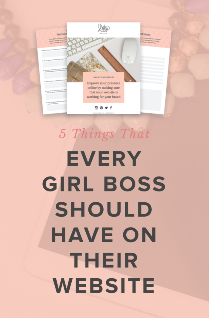
Now you have 5 action steps that you can take to up-level your website, this week. But, I know, there are countless ways to make your website more effective at reaching your audience and turning fans into clients. If you want to continue to make improvements to your online presence, then grab a copy of my free Website Workbook right here. As you go through the workbook, you’ll gain clarity on your goals so that you can make your website more engaging.
Become a go-to wellness pro with my Wellness Website Workbook:


In this quick video audit, I’ll walk you through what’s working (and what’s not) on your homepage. I'll share 3 personalized, actionable recommendations to help you improve clarity, connection, and conversions.
Free Homepage Audit for Private Practice Clinicians
Copyright 2022 - All Rights Reserved | Website made by Jules Design (of course!)
Terms & Conditions
Privacy Policy
Jules Design is a Richmond, Virginia–based private practice website design and brand studio serving dietitians, therapists, nutritionists, and healthcare professionals. We create strategic, client-attracting websites for evidence-based clinicians who want a polished and professional online presence.
